
Styles
Shabby Chic Today: Soft, Faded and Far Less Frilly
August 3, 2026 · 8 min read
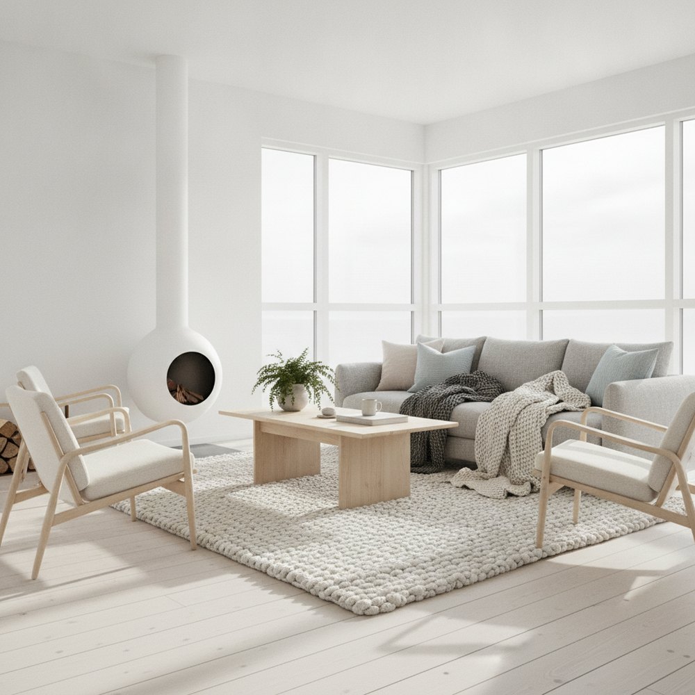
The version of shabby chic that still works is stripped back: chalky faded colour, genuinely worn painted furniture, washed linen, pale timber floors and one restrained floral. What dates it is the accumulation, ruffles, lace, bunting, hand-lettered signs and matching distressed sets bought at once.
Why the style got a bad reputation
Shabby chic peaked in the 2000s and then became shorthand for a specific kind of over-decorated cottage interior, which was unfair to what it started as.
The original idea, faded grandeur, comfortable rooms with good old furniture whose paint had worn, loose-covered upholstery, nothing precious, is genuinely appealing and quite sophisticated. It came from English country houses where things were old because nobody had replaced them, not because they had been distressed on purpose.
What killed it was commercialisation: mass-produced pre-distressed furniture, sanded to a uniform fake wear, sold as sets, accompanied by lace, bunting and signs saying things like Home Sweet Home. That version is what people picture, and it is worth separating from the underlying idea.
The modern version, element by element
Keep these, drop the rest.
- Faded chalky colour. Soft greys, dusty pinks, pale blue-greens, cream. Matt finishes only.
- Genuinely worn painted furniture, one or two pieces, not a matching set.
- Washed linen upholstery, ideally with loose covers that can be taken off and laundered.
- Pale or limed timber floors, or painted floorboards.
- One floral, on curtains or a single chair, at a large scale rather than a small busy print.
- Aged mirror and glass, which adds the faded quality without adding pattern.
What to leave out
The list of things that date the style is more useful than the list of things that define it.
Ruffles and frills on cushions, curtains and bedding. Lace of any kind. Bunting. Hand-lettered signs and wooden letters. Wire baskets with chalkboard labels. Matching sets of pre-distressed furniture. Small busy floral prints used on multiple surfaces at once. Pastel colour used at high saturation.
Removing all of those from a shabby chic room leaves something that reads as soft, faded and comfortable, and which most people would now describe as vintage cottage or faded English rather than shabby chic. That is fine; the name matters less than the room.
Doing the paint properly
The wear is the whole point, and applied wear is the thing most likely to look wrong.
Use a chalk or mineral paint that sands to a soft edge rather than chipping. Paint the piece properly, two coats, let it cure fully, then sand back only where a hand or a foot would genuinely have touched it over decades: edges, corners, around handles, the front of drawer fronts, the bottom rail.
Under-do it. A piece with light wear at the corners reads as old. A piece sanded evenly all over reads as a technique. And avoid the crackle-glaze finishes, which never look like real age.
Wax or a matt sealer over the top protects it and deepens the colour slightly. Our French country guide covers a closely related and slightly more grown-up version of the same approach.
Colour and pattern discipline
The single biggest difference between the dated and the current version is quantity.
Keep the palette to three colours, all desaturated: a warm off-white, one soft colour, and one slightly deeper version of it. Add texture rather than more colour, linen, worn timber, aged glass, unglazed ceramic.
For pattern, one floral in the room, on one surface, at a scale large enough to read as a pattern rather than a texture. Everything else plain. A large-scale faded floral on a pair of curtains against plain walls and plain upholstery is elegant; the same floral on the curtains, the cushions, the chair and the lampshade is the dated version.
Where it works best
The style suits some rooms considerably better than others.
Bedrooms are the natural home: soft, faded, comfortable and low-contrast is exactly what a bedroom wants. A washed linen bed, a painted chest, one floral and pale floors is a genuinely lovely room.
Bathrooms work well with a vintage mirror, a painted washstand and simple white sanitaryware. Kitchens work in older houses with a freestanding dresser and painted units.
It works least well in modern flats with square rooms, low ceilings and no architectural detail, where the faded quality has nothing to fade against. In that setting, the underlying idea translates better as a soft neutral scheme with one or two vintage pieces.
The one thing to spend money on
Upholstery, specifically loose covers.
The entire premise of the style is comfort without preciousness, and that only genuinely works if the covers come off and go in the machine. A sofa with washable loose linen covers is the piece that makes the room usable with children, dogs and real life, which is what the style is supposed to be about.
It costs more than fixed upholstery and it is the difference between a room you live in and a room you are careful in. Everything else in this style can be found second-hand and painted.
Test the restraint
This is a style where the difference between charming and dated is entirely quantity, which is hard to judge until you see it.
With Decorly you can photograph your room and compare a restrained faded scheme against a fuller one before committing to fabric and paint. For related styles, see French country interior design and cottagecore interior design.
Frequently asked questions
Is shabby chic still in style?
The restrained version is. Faded chalky colour, genuinely worn painted furniture, washed linen and one large-scale floral still look good. What dates it is the accumulation: ruffles, lace, bunting, hand-lettered signs and matching sets of pre-distressed furniture.
How do you paint furniture for a shabby chic look?
Use chalk or mineral paint that sands to a soft edge, paint two proper coats, let it cure, then sand back only where hands and feet would genuinely have worn it: edges, corners, around handles and the bottom rail. Under-do it, and avoid crackle glaze, which never reads as real age.
What colours suit shabby chic?
Three desaturated colours at most: a warm off-white, one soft colour such as dusty pink or pale blue-green, and a slightly deeper version of it, all in matt finishes. Add variation with texture, linen, worn timber, aged glass, rather than with more colour.
Which rooms suit shabby chic best?
Bedrooms, because soft, faded and low-contrast is what a bedroom wants, followed by bathrooms and kitchens in older houses. It works least well in modern flats with square rooms and no architectural detail, where a soft neutral scheme with a few vintage pieces translates better.