
Guides
How to Build a Room Colour Palette with AI (and Not Regret It)
August 30, 2026 · 8 min read
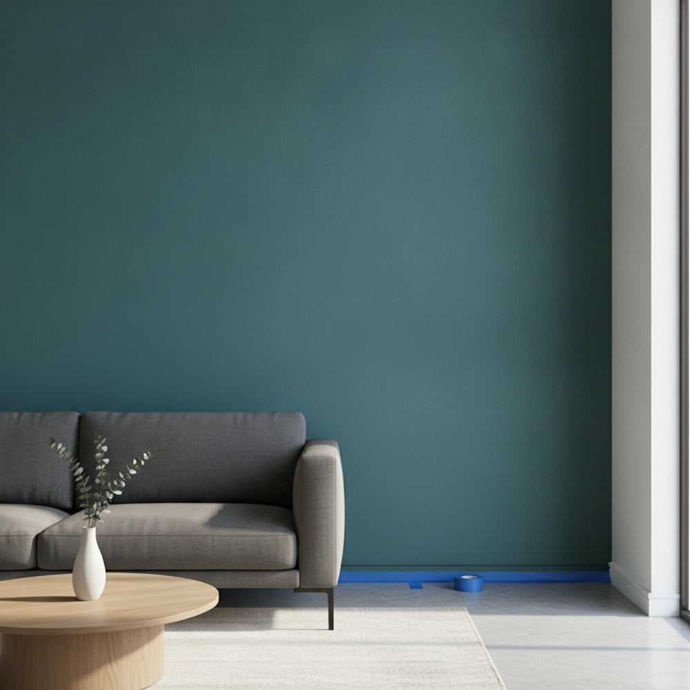
The reliable way to build a room palette with AI is to fix the proportion first and the colours second: roughly 60 per cent dominant, 30 per cent secondary, 10 per cent accent. Generate candidates on a photo of your own room, judge them in the darkest corner rather than beside the window, then match the winner to real paint with physical samples.
Why palette generators disappoint
Type "colour palette" into any AI tool and you get five neat swatches in a row. They almost always look good, and they are almost always useless.
A row of swatches tells you nothing about proportion, and proportion is the entire game in a room. The same five colours arranged as a mostly-white room with a coloured chair, and as a mostly-coloured room with white trim, are two completely different experiences. One might be lovely and the other unliveable.
It also tells you nothing about your light. Colour is not a property of paint; it is what happens when your specific daylight hits that paint on your specific wall. A swatch on a screen has been divorced from both.
Fix the proportion before the colour
The 60-30-10 rule is old, slightly crude, and genuinely works.
- 60 per cent dominant. Usually the walls, sometimes the flooring. This is the colour you live in and it should be the one you are most sure about.
- 30 per cent secondary. Large furniture, curtains, a rug. It supports the dominant rather than competing with it.
- 10 per cent accent. Cushions, art, a chair, ceramics. This is where you take the risk, because it is the cheapest thing to change.
- Neutrals are not free. White trim and pale timber still count towards the 60, which is why an all-white room with one blue cushion is a 90-0-10 scheme and often reads as unfinished.
How do you judge a palette on your own room?
Generate three or four candidates on your actual photo, then apply two tests that catch nearly every mistake.
First, look at the corner furthest from the window, not the wall next to it. Every colour looks fine in direct light. What separates a colour you will love from one you will repaint is how it behaves in the gloom, and a lot of fashionable greys go flat and slightly sad in the dark half of the room.
Second, look at how it meets the things you are not changing. Your floor, your door frames, your kitchen units if they are visible. Palettes fail far more often at the junctions than in the middle of a wall. A warm greige that is beautiful in isolation can turn faintly pink against a cool grey floor.
Warm or cool, and how to tell
The undertone decision matters more than the colour family and is the one people get wrong.
A practical shortcut: north-facing rooms get cooler, bluer light all day, so cool colours tend to go cold and slightly institutional in them, and warm colours are usually the safer bet. South-facing rooms get warm light, which can push already-warm colours towards yellow, so cooler shades hold up better. East-facing rooms are warm in the morning and cool by evening; west is the reverse.
This is exactly the sort of thing you can verify rather than take on faith by rendering the same colour in your own room. Our guide to wall colour psychology covers what different families do to a room's mood.
Palettes that reliably work
If you want somewhere to start rather than a blank prompt, these hold up across a lot of rooms.
- Warm neutral, oak, black. Off-white walls, timber furniture, black metal fittings. Almost impossible to get wrong.
- Deep green, brass, cream. Rich without being loud, and forgiving in low light.
- Plaster pink, terracotta, olive. Warm and earthy, works in dark rooms where grey fails.
- Charcoal, oatmeal, pale timber. Modern and grounded; needs good lighting to avoid heaviness.
- Off-white, sage, honey timber. Calm and slightly rustic, good for Japandi and Scandinavian schemes.
Turning a render into real paint
This is the step people skip and then blame the tool.
A rendered colour is a screen colour, and screens vary. Do not take a hex code to a paint counter. Instead, name the family and value, "warm mid green, slightly grey, not olive", and pull three physical samples in that region. Paint them on a piece of white card rather than straight onto the wall, so you can move them around the room, and look at them morning, afternoon and under lamplight before deciding.
That is two days of patience against fifteen years of living with the result, which is a reasonable trade. Our list of paint colours for 2026 is a good place to find the candidates.
Test palettes on your room
One photograph, three palettes, and the dark corner will tell you most of what you need to know.
With Decorly you can see your own room in different palettes in seconds, with your real window light and your existing floor still in frame, which is what makes the comparison meaningful. Then take the winner to physical samples. For more on combining colours, see how to mix colours.
Frequently asked questions
What is the 60-30-10 rule for room colour?
Roughly 60 per cent of the room in a dominant colour, usually the walls, 30 per cent in a secondary colour such as large furniture or curtains, and 10 per cent in an accent like cushions or art. Fixing proportion first is what stops a good set of colours becoming a bad room.
How do I test a paint colour properly?
Judge it in the corner furthest from the window, not beside it, because that is where colours reveal whether they hold up. Then paint physical samples onto white card, move them around the room, and check them in morning light, afternoon light and lamplight before buying.
Should I use warm or cool colours in my room?
It depends on the aspect. North-facing rooms get cool light all day, so warm colours usually work better; south-facing rooms get warm light, so cooler shades hold up. East and west rooms flip between the two across the day, which is worth rendering before committing.
Can I take a hex code from an AI render to a paint shop?
No, screen colour and paint colour are not the same thing and screens vary. Describe the family and value instead, then pull three physical samples in that region and compare them in your own room across the day.